Skip to content

Client: Design Build Services
Project Summary
Develop a powerful, exciting brand in collaboration with Design Build Services for their flagship project, District 56.
The Big Picture
DB Services was hard at work on their flagship development, a residential and commercial hub in the heart of beautiful Langford, Vancouver Island, B.C. They reached out to us with the task: create the voice, look and feel of this momentous new project that captured the key elements that set it apart.
We were just as excited as they were, and for good reason: the results were spectacular.
Client Goals/Objectives
The core goals of the branding for District 56 were simple:
- focus on people-centric design and living
- show how the development services the community with homes and business spaces for modern living
- educate our audience about how D56 is different, from design through to the use of revolutionary building materials
Our challenge was to bring these goals to life in line with the values that are key to our friends at Design Build Services. We think we’ve achieved that result.
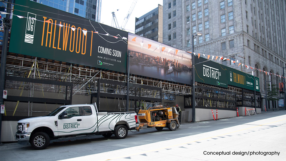
What is District 56?
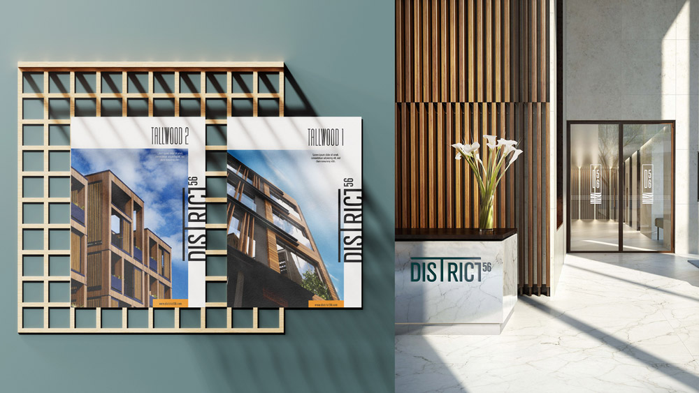
Set to be complete in 2021, District 56 will stand to be the tallest Mass Timber-built development in Langford, featuring two taller, 12-storey towers–aptly named Tallwood 1 and Tallwood 2– with commercial space on the ground level and residential living above. At the heart of District 56 is The Terminus, a 5-storey building designed as the central hub for life and commerce, with exclusive commercial space bringing a curated experience to residents and businesses, creating a self-sustaining community with everything you need just steps away from your doorstep.
The Solution
A modern project in the middle of an urban landscape, like a beautiful plant emerging from the concrete, District 56 will embody the perfect contrast of nature in modern architecture.
District 56 will be A CULTURAL OASIS for all within the community, professionals, families, businesses.
Our concept takes evolution from the TALLWOOD. featuring length throughout our design, we took inspiration from lightforms within wood. Our logo and brand assets forever articulate the length and strong standing monument built for community living.
- Branding & Identity
- Colours
- Logo
- Iconography
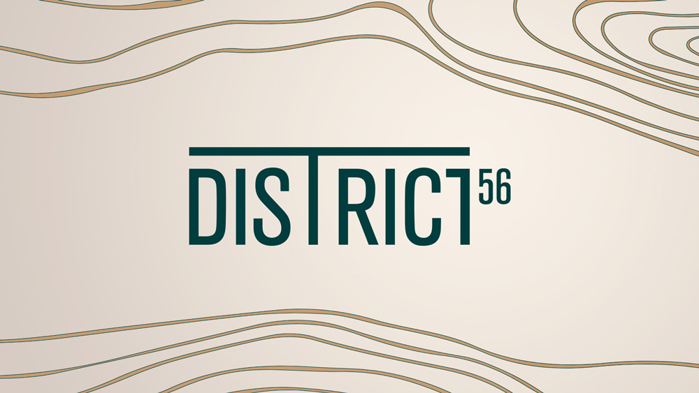
Our colour palette embodies modern nature, with earthy deep green and subtle bronze tones we represent the calmness of nature. With the splash of our rich orange we effortlessly bring modern urban living to the colour palette.
- Custom Photography
- Research
- SEO
- UX
- Website
- Social
- Video
- Advertising
- Events
- News
- Contests
Results
The branding was then used to create a website, social channels, a social strategy, outdoor posters and banners. The brand voice, colours and identity can be found across all channels to form a consistent and identifiable message that stands out from competitors and makes it recognizable in the community.