Skip to content


How Colour Psychology Influences Consumer Emotions
Colour and Food are deeply connected in shaping how we perceive, feel, and respond to messaging. The psychology of colours in advertising play a crucial role in swaying consumer emotions and decisions, especially in the food industry.
The Role of Colour in Food Marketing: Why We Eat With Our Eyes
Colour is the most essential sensory cue when it comes to setting a consumer’s expectations about the taste and flavour of food. From the deep red of a ripe strawberry to the golden brown of a perfectly baked loaf of bread, colours have the power to spark appetite, create cravings, and even shape your perception of taste.
On a subconscious level, people expect certain flavours to match particular colours and thus evoke specific emotions. Which is why, consumers will subconsciously stop engaging with a food advertisement that doesn’t conform to our deep-seated psychological associations with colour. It’s a make or break!
This is not to say that there aren’t exceptions to this, but ads have to then tap into emotional prompts that are stronger than food colour. An excellent example of this is when a Burger King Ad featured a mouldy Whopper decomposing over 34 days to announce the removal of artificial preservatives from the iconic sandwich. While the ad was the opposite of appetizing, it speaks volumes about the freshness and quality of Burger King’s ingredients as well as the elimination of health risks associated with long-term consumption of preservatives. When something is perceived as a potential threat to survival, it takes precedence over colour association.
Exploring the Colour-Emotion Relationship
We’ve seen how the psychology of colour plays a profound role in shaping our perception of food. Ready to dive deeper? Let’s explore the connection between specific colours and the emotions they evoke to understand what each colour communicates.
The colour red awakens our primal desires and the need to satisfy our hunger. It stimulates and excites. It heightens the appetite by increasing the heart rate. Now you know why red is everywhere in the food industry!
The colour orange ignites excitement and enthusiasm. It’s often used to advertise snacks and sweets because it’s fun, energetic, and evokes a sense of adventure. Close your eyes, and imagine a plate of cheesy nachos or a bowlful of cheese puffs—they were orange, weren’t they?!
The colour yellow sparks happiness, optimism, and the promise of a delicious and dependable meal. Often associated with sunshine, this colour is a prominent fixture in breakfast-related advertising.
The colour green symbolizes life, health, and nature. It’s often associated with freshness and vitality, making it a popular choice in the promotion of fruits, vegetables, and organic products. Green evokes a sense of well-being by conveying the idea of wholesome, nutritious ingredients that are in tune with the environment.
The colour blue inspires freshness, purity, cleanliness, serenity, and relaxation. It’s often used to advertise seafood as well as chilled food products. However, brands need to know that blue can also suppress hunger—this is because there are very few naturally occurring blue foods in the world. A study done in the 1970s revealed that consumers reported a loss of appetite (some even became ill) when they were presented with a steak that was dyed with blue food colouring, despite the product being perfectly edible.
The colour purple signifies sophistication and creativity as well as mystery and allure. That’s why it’s used to advertise upscale as well as unique, intriguing culinary experiences. Purple is seen in nature in grapes and berries, which is why it is also used to promote sweet, indulgent foods.
The colour brown embodies warmth, comfort, reliability, and tradition. This is why, it’s frequently seen in advertisements for hearty, home-cooked meals like roasted meats, baked bread, and desserts. Brown invites you to indulge in nostalgic, familiar, timeless flavours.
The colour black incites sophistication, elegance, and gourmet experiences. It’s often used in high-end food advertising to create an air of exclusivity and indulgence and evoke a sense of luxury and refinement.
The colour white emanates purity, cleanliness, simplicity, and transparency. In food advertising, it’s commonly used to convey freshness and a clean slate. White plates, dishes, and backgrounds in food photography highlight the food’s natural colours and make it look pristine. Brands promoting yogurt, milk, and fresh produce often make use of white to emphasize the natural and pure qualities of their products.
Let’s Talk About Colour Combinations
Now that we understand the kind of emotional and decision-making impact individual colours have, imagine what different colour combinations can do!

Red + Yellow
This dynamic combination is often used to convey excitement, energy, and hunger. It’s frequently found in fast-food branding, like McDonald’s, where the bold red and yellow colour scheme triggers the desire for a quick and delicious meal.

Red + White
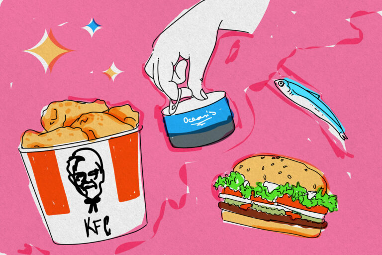
This is a classic and versatile pairing. Red stimulates appetite while white conveys simplicity and purity. Brands like Coca-Cola and KFC use this combo.

Green + Yellow
This combination conveys a sense of natural, wholesome products. It’s used for branding organic and healthy food items, emphasizing freshness and vitality—like with Subway.

Green + White
The pairing of green and white is associated with freshness, health, and purity. Brands like Starbucks and Whole Foods use this combination to highlight the freshness and natural qualities of their ingredients.

Orange + Blue
This combination creates a sense of contrast and vibrancy. It’s often used for snacks and beverages. The energetic orange contrasts with the calm blue, emphasizing the excitement of the product—like Doritos does.

Blue + White
Blue and white suggest cleanliness and reliability. It’s often used in branding for seafood restaurants as well as products like Ocean’s Tuna to promote freshness, purity, and sustainability.
There are many more colour combinations to explore—do your research to inform your palette!
Cultural and Regional Influences on Colour Perceptions in Food
While there are common emotion and colour associations, it’s important to recognize that cultural and regional factors can also play a significant role in how someone relates to colours in food advertising. Different cultures have varying interpretations of colours. For example, red is associated with luck and celebration in Chinese culture, but symbolizes danger in other parts of the world.
It’s crucial for us, as marketing professionals, to be mindful of these nuances and consider diverse cultural perspectives when choosing colours for food advertising campaigns. What may be appetizing and appealing in one culture could have a different connotation in another.
Food Advertising is a Delicious Adventure Shaped by the Psychology of Colour
The psychology of colour in food advertising sheds light on what shapes delicious experiences, both at the conscious and subconscious level and unlocks the doors to our cravings and emotional connections. It is a powerful tool that advertisers can use to evoke specific feelings and stimulate the appetite of consumers.
From the primal reds that ignite our hunger to the fresh greens that promote well-being, each colour fulfills a different emotional expectation that we have from food and flavours. When combined with elements like branding, design, and cultural considerations, colour becomes a vital ingredient in the recipe for a successful food advertising campaign.
The next time you find yourself drawn to a delectable food advertisement or a tempting snack package, take a moment to consider the hues involved—you’ll begin to see how colour psychology influences your desire for food. Whether we’re aware of it or not, colour plays a pivotal role in every single food decision we make.
Ready to use colour psychology to make your brand irresistible to consumers? Get in touch and let’s cook up something delicious!